Trying to stay fresh and up to date can sometimes be tricky, especially when trying to appeal to a wide demographic. Most of the time, a church’s website will be the first point of contact to new visitors or members, so we recommend a few key items that may greatly improve the overall success of serving and recruiting. Nowadays, it is a MUST to have a responsive website design that is easily viewable on a desktop computer, as well as a smartphone or tablet. Church administrators may find that large imagery, easy navigation and simple forms will provide visitors a warm and comfortable experience while browsing through web pages.
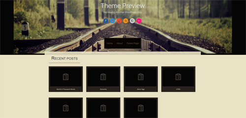
Sixteen: With a vintage look, this one is one of my favorites themes available from WordPress.org because it is very straight to the point. It has a large spot to place a picture of your church with a very easy navigation bar. I also really like when you navigate to the sub pages, the main picture stays at the top but falls behind ensuring not to intervene with the content.
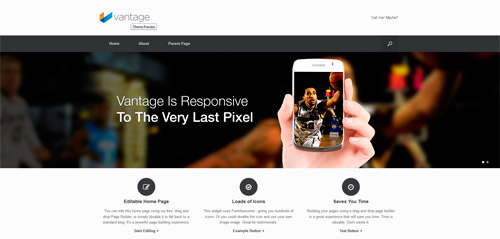
Vantage: Large scrolling images on the home page makes this an obviously appealing choice. The them maintains a very clean, simple look throughout the various pages. Everything from the color scheme to the font to the stationary banner makes this website extremely easy to navigate for the rookie user, yet appreciated by the veteran user.
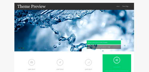
Asteria Lite: Definitely my favorite automated slider which has different transitions between the pictures. I also love how the hover feature works. When hovering over a link, not only does it do a little jump, but it also changes colors. This is a very interesting feature that ensures users always understand where they are on the screen. The comment text area is a little too light, but a developer or researcher can bring up the contrast no problem.
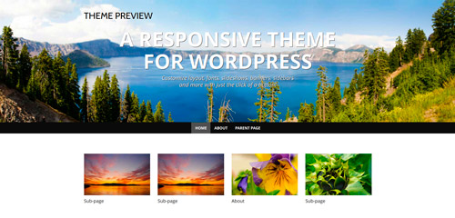
WP Simple: The epitome of a simple layout with minimal features. The nice wide banner on the top allows for a large picture with the navigation bar below it. There’s nothing fancy about this layout which is the theme’s main draw. I think this is a really great starter website.
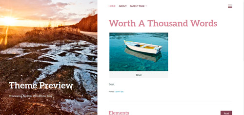
Bushwick: This is one of the only WordPress.org blogging layouts I have came across that showcases the picture on the left hand side of the page rather than on the top. It is also stationary no matter which page you navigate to. Very unique. This layout is very easy to navigate with simple fonts and color choices.
Choosing a website template can seem very overwhelming for any church administrator. Making sure to appeal to the newbie web user who is using a desktop computer and the techie pro using their iPhone can be a little tricky. No need for flashy plug-ins to confuse the user. Overall, keep it clean, simple and straight to the point. See a template you like? Click on the photo to visit WordPress’s website for a free download!
