Here are a few issues that you should consider when turning in your file to us.
1. Resolution
Resolution also known as DPI (Dots Per Inch) or PPI (Pixels Per Inch) can be described as the number of dots that fit horizontally and vertically into a one-inch space. Generally, the more dots per inch, the more detail captured and the sharper the resulting image.
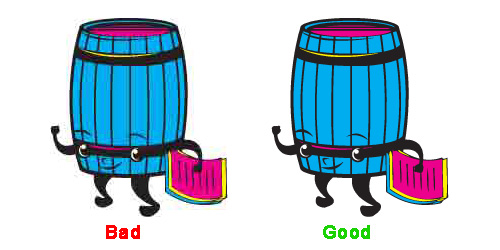
Below, you see two of our old PrintKeg logos. The first one is an example of an image printed using 72 DPI (common for web graphics). The second image would be the difference of a printed image at 300 DPI.

Also, you cannot re-size an image that is 72 DPI to 300 and expect it to look good. It will only look blurry. When creating your artwork, be sure to start off with a 300 DPI file and always save as high quality.
2. Color
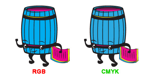
Color mode must be CMYK or RGB to qualify as a print ready file, but CMYK is highly recommended for the best results. We do our best to ensure your image is printed in the way that it looks, but we cannot always guarantee that will happen. Fortunately, most customers are very happy with our ability to color match.

By default, we convert all files to CMYK color mode.
3. Bleeds, Trim and Safe Area
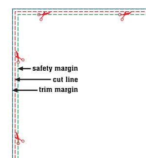
Bleeds are required in all artwork with an image extending to one of the borders. Add an 1/8″ (add .25 to your canvas) bleed area to each side to allow for cutting. For example, a 11” x 17” poster with full bleed, the image size should be submitted at 11.25” x 17.25” (blue border). The bleed zone consists of the areas starting from the safety margin to the edge of the paper.
0.125″ (1/8”) on each edge of the poster will be trimmed off during the cutting process. This will leave you a 11″ X 17″ standard poster (red lines).
Keep important type (text) about 0.125″ (1/8”) away from the trim line on each side. This will guarantee your text to not be cut off. (green lines).

If you request a digital proof, we will email you a file that places your artwork under these lines so you can get a clear idea of what could get chopped off.
4. Fonts and Transparency Issues
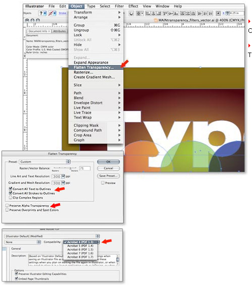
Fonts, transparencies and other effects used in vector format softwares (Illustrator and InDesign) must be flattened and the fonts outlined. Not flattening transparencies or outlining fonts may result in some text or graphics dropping out from your artwork.
By default, we do not accept fonts NOT outlined and we flatten all artwork, but the more you do the most likely your art will print correctly.
Doing this in Adobe Illustrator

Make sure to CHECK “Convert All text to Outlines” and “Convert All Strokes to Outlines”
Make sure to UNCHECK “Preserve Alpha Transparency” and “Preserve Overprints and Source Color”
Save file as PDF 1.3