Commercial printing can be a wonderfully rewarding experience for artists, marketers and entrepreneurs. Yet, It can also become frustrating since not everyone is a qualified graphic designer or knowledgable of the graphic communications industry. Improper file prep can lead to a final print product not meeting quality expectations or color disireability.
Below, we describe the five most common file preparation problems that we encounter and how our commercial print company deals with those issues.
You may also be interested in reading our 7 Deadly Sins of Printing by Jessica Otte.
Font Issues
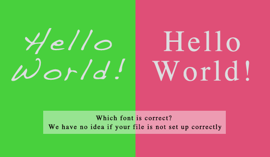
Files turned into any commercial printer should include embedded fonts, outlined fonts or flattened layers. Anyone fairly experienced with Photoshop will understand how to flatten layers (Image // Flatten or CTRL F). PDF’s created in software like Adobe Writer, Illustrator, InDesign, Quark) should include font files or fonts should be outlined.
If there are fonts not outlined, embedded or flattened, we notify the customer and place that order in the “Art Issues” status until a new file is submitted.
Wrong Color Mode
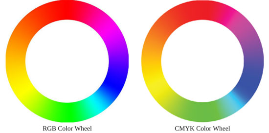
Generally, in most print environments, working in the color mode CMYK will solve most issues with color output. There are many other factors and processes to be considered when dealing with colors like monitor brightness, office lights, color profiles, media profiles, workspace management and so much more. However, a good rule of thumb is to work in CMYK color mode. Many customers work in RGB mode, a color spectrum that reaches a wider array of colors than CMYK and is mostly utilized by monitors, TV sets, scanners and video players. We automatically convert all files (accept wide format prints) to CMYK ensuring print files play nice with our production presses.
This below image shows an excellent comparison of the color ranges of RGB versus CMYK. Often times, files may not look much different and yet the opposite scenario can also be true. Customers who convert their files will have a better idea (although not necessarily perfect) of how their final prints will appear.
Generally, we convert all files to CMYK which could result in major color differences. If we feel color conversion will be problematic, a notification is emailed to the customer with an attached digital proof. We do not convert wide format prints (16×20 and up) since they are printed on machines that support a wider color spectrum than our digital printing press.
Inadequate Bleed Area
Many commercial print companies require an extra outer area called “bleed area” for trimming purposes. This process allows an image to reach the edges of the paper or media. If an image is not extended properly, white lines could appear on final prints. Our company designers work diligently to adjust customer art, but some art is not so easy to fix. Not providing a bleed area may result in unforeseen delays or unwanted results. View this video tutorial if you do not quite understand what bleed area is.
In the below example, we demonstrates how important text can get clipped if a proper bleed area is not achieved.
Our experts do their absolute best to create bleed area for files without that extra space. If we cannot fix the file, we will contact the customer and place the order in an “art issues” status. We will not print files that do not supply enough bleed area for quality assurance purposes. Sometimes, at the customer’s request, we can add a border or margin if adding a trim area is simply not possible. Fees may appl
Low Resolution
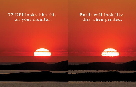
For us, and many other print companies, 300 DPI (dots per inch) is the optimal resolution for printing. Web graphics are usually not print friendly despite their crisp appearance on monitors. 600 DPI is even better, but many companies will reduce that resolution for faster operations. Our company will print sizes 13×19 and under at 600 DPI, but 300 DPI is recommended and 150 DPI is our minimum. 72 and 96 DPI (web graphics) are not typically suitable for quality printing.
If a file is under 150 DPI, we will notify the customer and ask for a higher quality graphic. The below image demonstrates how art might appear at lower DPI levels.
Inappropriate File Types
To reduce image degradation, try to stick with TIFF or PSD (or a program’s default saving extention) when saving. PDF’s and JPG’s are the most common files turned in to us, which is generally fine, but designers should only save to these extensions after a design is completely finished. Microsoft Word and PowerPoint files are usually not print friendly in a commercial setting. Users of those programs should convert their work files to PDF.
Internally, we convert all files to PDFs which is required by our workflow.
Conclusion
File preparation is a key element to maintaining print quality. For further assistance, please do not hesitate to contact a Printkeg representative.


