Vistaprint ain’t the only online print company with a kick butt business card deal. This week, we’re celebrating our new blog design with 250 business cards for only $10. We won’t stick our branding on your card, cards ship within a few days, and we print on fantastic 110# gloss or 100# matte card stock.
We’ve seen and printed a bunch of nice designs for business cards through the years. But today, I wanted to share some inspiring business card art I spotted while rummaging through Pinterest.
1. Plume & Post Clean Business Card
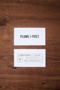
First, I personally like clean, simple and white space. This double sided business card not only meets those requirements but also demonstrates an elegant yet technical aura. I really gravitated towards this nice concept that many may not appreciate. Design by A Pair of Pears.
2. Colorful Business Card
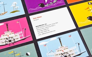
This business card for Sean Adam particularly caught my attention due to the colorful nature and interesting variety of backgrounds. Whether or not the designer decided to print multiple backgrounds is unknown, but with variable data now available that is certainly possible. In fact, some print companies, like Moo.com, have really popularized this trend in the last few years. The font of this business card is clean and easy-to-read while the back is entertaining and shows off the artist’s talent. We still see many single sided cards being printed, but I really think everyone should take advantage of the real estate of both sides.
3. Yellow Business Card
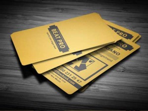
A few things stick out about this business card to me. First, the brave two color design featuring a golden yellow. Secondly, it is a smart and nice looking vertical setup. The front side of this card is simple and the back is crammed with information, yet still seems organized and thoughtful. This particular print boasts rounded corners and a downloadable design template is featured on Envato Marketplaces as Creative Business Card V2 for $6.
4. Square Business Card
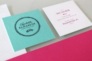
Square business cards are not nearly as popular as the traditional 3.5×2 size. I felt the above square business card example demonstrated exactly how this type of card could be successfully implemented. The designer kept it simple by sticking with only the circular logo for one side then restricted what contact information is available on the back. This hybrid implementation is a perfect example of how square business cards can be functional and unique.
5. Unconventional Business Card
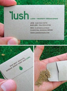
First, I am not one for unconventional business cards. Most are die-cut or require weird folds that can sometimes defeat the purpose of what business cards are meant for. Despite the alternative branding opportunities unconventional business cards can offer, some cards blend both worlds wonderfully such as this card for lawn and property enhancement company, Lush.
At first glance, this well-designed business card seems quite standard using the traditional wallet size. The card is actually stored in an envelope with seeds engaging the customer while strengthening brand awareness. Simply brilliant and Designed by creative agency STRUCK.
And finally
In the past, I have discussed some tips on what should information is most vital for business cards. If you would like to discuss the refreshing of your business cards, please contact us anytime.


