Designing a logo can be very tricky. Especially when working through a third party. Often times, the client does not know what they want until they actually see it. They tend to provide the designer vague, poorly descriptive words on what they think they want, but in all actuality, most of the time, they have no clue.
Generally speaking, many clients know very little about good print/logo design, and have absolutely no experience. For instance, a web developer may be able to create an awesome website for their customer but require assistance for a logo design which is why customers like that turn to graphic designers in the first place! We as designers must try to think like the client and their customer to come up with a visually appealing design to represent their company.
Recently, I jumped on board to redesign a logo for a local company – Sweet Grass. I was working with a third party, Joe, to design the client’s logo while he was hired to design an e-commerce website for the company. We were first approached from Joe with this email regarding the project:
“Here is the current Logo. She is looking for something a little more modern. She would like the Sweet to be a pastel pink and the Grass to be a pastel green. Everything else is up to us (more specifically you.) She likes the Southern charm thing and it’s primarily a womens apparel store. So…I leave it to the experts.”
Thankfully they were not in a rush, as I became bombarded with custom designs that week. Good design can never be rushed — remember that. As with most designs, I do my research by observing what the competition is doing. Questions I might ask myself are: What is the popular design trend for clothing stores? What is important to my client? Who do their clients represent? What comes up in the Google images when I search words like “Southern Charm” or “Modern”?
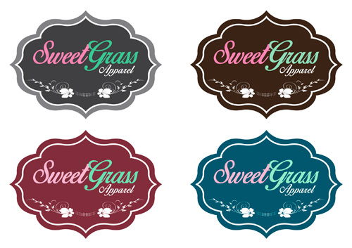
With little information to go on other than my imagination, I examined the old logo and tried to revamp it while trying not to go with something completely different. When designing logos for clients, we like to provide options. It is a good idea to take the main logo and design it in different color schemes. Below is my first submission to the client.
I wait on the verdict…..
“Hi Jessica, I love them, however the customer thinks they look to “Sweet.” Here is what she said: ‘I was hoping to do something with the first letters only. A little more modern. Maybe the letters overlapping in a creative way. The ones you sent me look too “sweet”. I want modern but with pink and green.’
I asked her if maybe something like a big pink S and a big green G with just normal letters and she said that it sounds good. She wants it “modern.” Not sure what that means in the design industry…”
I was slightly annoyed that the information of using the “S” and “G” was never mentioned in the beginning of the design process. On the flip side, the client probably did not know what she wanted until she saw an example. I already know that I should have prepared questions and submitted them beforehand. Lesson learned.
Nevertheless, time is money . . . back to the drawing board!
I did more research. . . . I needed inspiration! Google is my best friend, so I Googled key words like:
- “modern”
- “modern logos”
- “women’s apparel logos”
- “simple logos”
- “clean logos”
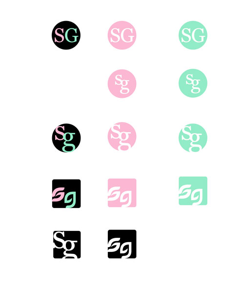
I did not want to utilize a font that was too crazy, so I went with a classic favorite of mine – Georgia. I also wanted to play on the actual meaning of the word “sweet grass” so I selected the grassy looking font PetalGlyph. Using the clients pastel colors of pink and green, I gave her a few different variations of the “S” and the “G” in a circle as well as in a square trying to be very basic while embracing a more flat and simple design approach.
I wait on the verdict…..
“Hey again. Here are the pink and green they would like to use.”
This “pastel” pink and green looked way different than the colors I sent over in the first two designs, so I email Joe back:
“Does she want to see all the designs that I recently sent over in those pink and green or did she pick out a specific logo design?”
Joe shortly emailed me back with this response:
“I sent them all. She says it looks like she is selling old lady clothes out of a country store. Her words, not mine. She wants it modern and nice…”
A little more “modern” and “nice”? What does that even mean? I was completely lost now! How did the simple designs I just sent still look like old lady? I emailed Joe back with utter confusion:
“Hey Joe,
I really do not understand what she’s looking for. With the colors of pastel pink and green, it’s always going to look old lady. In your first email, you said she likes the Southern charm, but when she gets that, she thinks it looks like a country store or too sweet? lol So I go on the opposite side of the spectrum with this past design, I sent multiple clean, simple “modern” designs, so I am not sure what she thinks modern is. lol Did she give you ANYTHING else to work with? Any comparisons?
I will get back to the drawing board and get with Chris to see if he has any ideas for nice but not too sweet, modern country. Do you have any ideas?”
Come to find out, Joe did not see nor send the second batch of logos to his client. It all makes sense now! Joe and I agreed we needed to talk over the phone.
Joe explained that his customer wanted the “S” and “G” in a script type of font and then the other letters in “sweet grass” to be a plain, san-serif font. She still wanted to use the colors of pastel pink and green, with the pink representing the sweet and the green representing the grass. I instantly had an idea while we were talking.
Time is money . . . back to the drawing board!
I came up with variations of the instructions I was given through different typography variances. I also revised some of the earlier versions of the “S” and “G” in the circle and square as these were, technically speaking, more “modern” in terms of the design world.
Again, I wait on the verdict…..
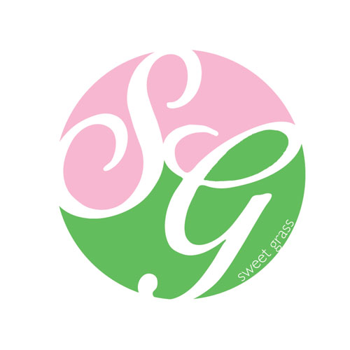
“Just found this in my inbox, LOVE the center circle one with the S and G!!!!!
So excited!”
Yay, we have a winner! It just so happened that middle logo was my personal favorite as well. Good choice Mrs. Client, good choice!
Overall, this particular design process took a little over a week before we came up with the perfect logo to represent the new and improved Sweet Grass. The company was getting a makeover, and I designed the face of it. A very cool feeling. Logo design can become exhausting and frustrating at times, especially when working through a third party, but most of the time the outcome is worth it. I cannot wait to see the logo hanging outside on the store sign.
When working with a 3rd party for logo design, remember this: Communication, communication, communication.
