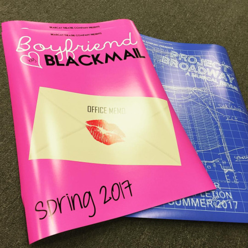

There is nothing like an eye-grabbing poster to attract the attention of consumers. When you are looking to get noticed, one fantastic way is to pepper your town with posters that pop. Posters are incredibly powerful in their ability to convey essential information in an arresting manner. When people see a beautiful poster, they are very likely to remember the message. If you want to harness the power of the poster, follow these five tips for making an eye-catching poster.
Read more about NASA giving away free posters.
Jessica Kane is a professional writer who has an interest in graphic design, marketing, and printing. She currently writes for 777 Sign, her go to place for banner signs, custom flags and custom signs printing.
- Balance Is Key
As in every other aspect of life, balance is essential when you are composing a poster. A poster that is not balanced well will be jarring to the eye, and this will cause your message to be lost before it is ever absorbed by the viewer. Any graphic artist should be familiar with the rules of two-dimensional composition, which will naturally keep compositions balanced when followed closely. You don’t have to be an expert to create a balanced poster.
- Think of a Poster Like a Recipe
The best recipes are usually crafted from just a few delicious ingredients. You should follow a similar philosophy when you wish to create beautiful posters. The worst mistake you can make is to overwhelm the viewer with your poster’s composition. When in doubt, less is more. Stick to a few colors, a few phrases and a few details. Keeping the message on the poster as simple as possible will increase the chances that it is remembered.
- Vary Your Text Sizes to Convey Importance
One of the most important rules to remember when crafting a quality poster is to use a text hierarchy to designate the importance of the information on the poster. The most important information should obviously be in the largest font. A good method of organizing fonts is to use three sizes of fonts, running from largest to smallest or vice versa.
- Make It Look Professional
Few things will get your poster ignored more quickly than if it looks cheap. The posters that grab the public’s attention are works of art. They are so beautiful that they cannot be ignored. If you want to make sure that people will take the time to look at your poster, then you should open up your wallet and pay for a gorgeous print job. The glossy luxuriousness of an upscale poster is nearly impossible to ignore.
- Make Sure It’s Readable
An often easily overlooked part of making a great poster is the simple task of making sure it’s readable. The attention span of the average human being grows ever shorter. If you want to make sure that your message is received by the viewer, you need to make sure that all the text on the poster is easily legible. Don’t use crazy fonts. Instead, use fonts that are grasped in an instant. Arial is always a great choice. Don’t forget to ensure that the contrast between the background color and the text color is sufficient to make the text pop off the poster.
Conclusion
As you can see, it takes a lot of careful planning to put together a professional poster. If you follow these five tips to craft an eye-catching poster, you will come up with something beautiful that is sure to get noticed. Just remember that editing the poster down to its barest essentials is usually the right choice. Keep things simple to make posters their most powerful.


