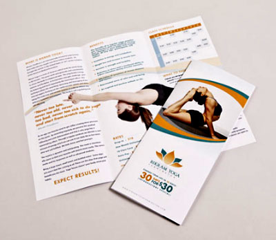
1. Unique Info – First, don’t try and regurgitate the same information from your website. Condense and fine tune which information deserves paper real estate and try to offer unique information not available through any other marketing medium. This could include one of your social networks, some useful tips (we’ll hit on this again later), different photographs..anything.
2. Make it a keeper – Give your brochure purpose and reason for customers to keep it. For instance, a paint company could show off color palettes, offer painting tips, list advantages of the different paint brands etc. Basically, anything that entices customers to magnet that sucker to the fridge. Adding coupons with a call-to-action works great too.
3. Value in your words – Make absolutely sure all segments of information on the brochure is valuable. Remember, providing every single detail about your business is not necessary. The information should be concise and beneficial to readers.
4. Use high quality graphics – Listen, print is a medium where high quality photographs can make a serious imprint onto customers. Refrain from using web graphics that are way to low in resolution to look appealing and stay away from utilizing clip art.
5. Hire a designer – If you’re a designer or have a good eye for design….great. But if not, recognize this weakness and hire someone that can develop a well designed brochure that properly relays your brand’s message. A brochure can demonstrate your professionalism, quirkiness or love for a product, but that’s a double-edged sword. Poorly designed brochures can make a business appear unprofessional.
6. Contact information – A brochure should include all of your contact information. Because a brochure is longer than a business card, it gives you the opportunity to provide contacts with more than your phone number and email address—as Sarah Jacobsson Purewal suggests at PC World, “Instead of including only your usual social media handles for Twitter and Facebook, for instance, consider adding a link to your Yelp page.”
7. Call to action – Don’t assume your audience will be moved to contact you or purchase your product or services after they read your well-crafted brochure. The call to action is the extra push that, for many readers, makes the difference between simply reading your brochure and acting upon it.
Good luck with designing your next brochure. We hope these tips help.


