Categories
Printing, entrepreneurship, and art blog
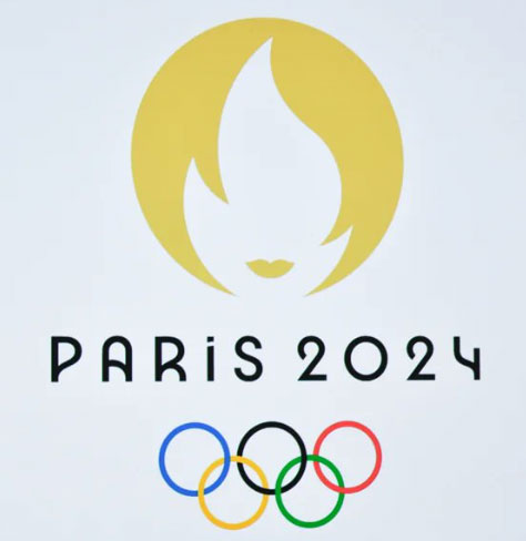
Why do people dislike the Paris 2024 Olympic logo? The logo, a symbol of unity and global celebration, has sparked various reactions, each with its own valid perspective. If you look at the logo from one perspective, it appears like a flame with lips. Looking at it another way, you may see a woman with a bob and some lips. Both perspectives are basically a hot girl. For this reason, the logo has been heavily mocked on X.
Some find the design intricate, featuring a blend of three elements: a gold medal, a flame, and Marianne, a national symbol of France. Critics argue that this fusion dilutes the logo’s distinctiveness and makes identifying more challenging. The design’s abstract nature and use of negative space have led to diverse interpretations. While some in graphic design admire its ingenuity and symbolic depth, others seek clarity and a more direct representation of the Olympics or Paris.
There is also a growing trend towards minimalist design in branding. The Paris 2024 logo, with its intricate details and multiple elements, contrasts sharply with this trend. As a result, some people view it as outdated or overly ornate. The logo is often compared to past Olympic logos, many of which were more straightforward in their representation. For example, the Tokyo 2020 logo was praised for its simplicity and modernity, making the Paris 2024 design seem less appealing by comparison.
By incorporating Marianne, a potent symbol of French national identity, the Paris 2024 logo may not resonate as strongly with an international audience. While it holds profound meaning for the French, it might not be as immediately impactful or relatable to viewers from other countries. The unveiling of Olympic logos often carries high expectations, and when the Paris 2024 logo was revealed, it may not have met some people’s expectations, leading to disappointment and criticism.
Here are a few more reactions from X (formerly Twitter):
Overall, the logo’s reception is a mix of subjective preferences and differing opinions on design aesthetics, cultural symbolism, and brand identity. It seems to hold up well if you review the logo in practice (like on their website) rather than in isolation. Unfortunately, graphic bloggers on websites like Creative Bloq document that the logo looks like a Tinder app logo, hair salon logo, or condom packet logo. That’s pretty brutal.